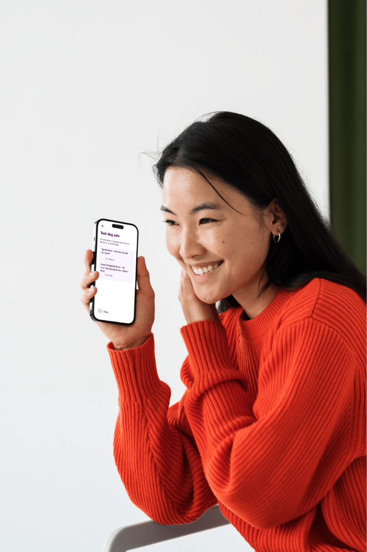
Investment Fund App
UX case study of a mobile investment app designed to make fund investing more accessible and understandable for younger users.
Role: UX Designer & Team Lead
Context: Student group project (4 designers)
Platform: Mobile app (with iPad adaptation)
Target group: Gen Z and young millennials
Many young adults find investment platforms complex, intimidating and difficult to get started with. Financial terminology, unclear interfaces and a lack of guidance often create barriers for first-time investors

The problem
As a result, investing can feel overwhelming and disconnected from everyday life, especially for users with limited financial knowledge.
The challenge

Design an investment fund app that feels approachable, trustworthy and worth returning to — without oversimplifying the product.
My role
I worked as UX Designer and Team Lead in a group of four, with responsibility for both the design process and team coordination.
• Team lead and workshop facilitator
• User research (interviews, surveys and analysis)
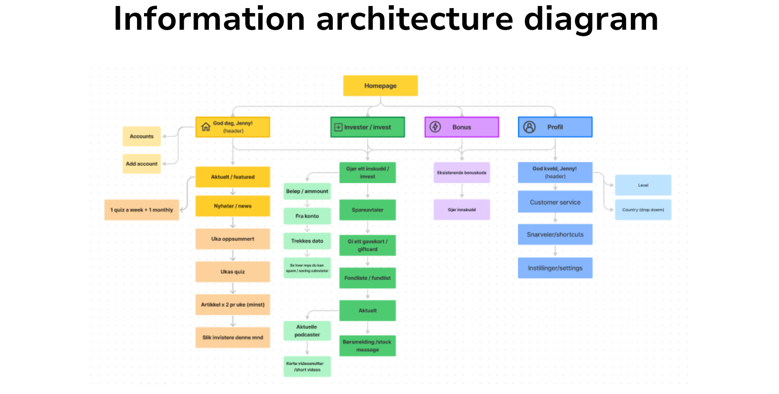
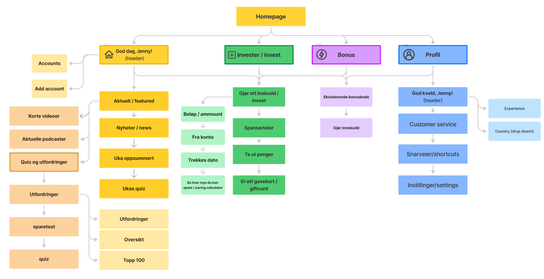
• Information architecture and user flows
• Sketching and wireframing
• High-fidelity prototyping
• Usability testing (round 1 & 2)
• Report analysis and design recommendations
• Design system and iPad mockups

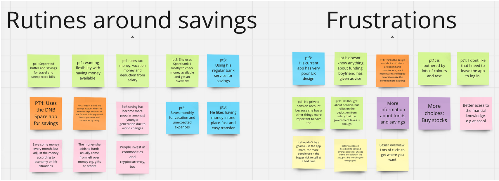
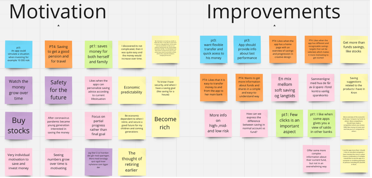
Research & insights
The research phase focused on understanding how younger users perceive investing, and what prevents them from getting started with fund investments.
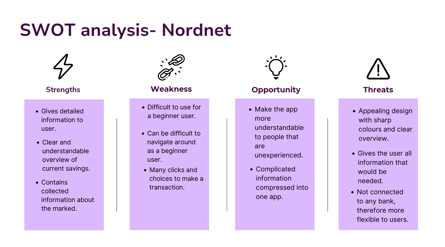
The research included qualitative interviews, surveys and supporting methods such as SWOT analysis to identify patterns, motivations and barriers among younger users.
Research helped define a persona to guide us further in the design process:
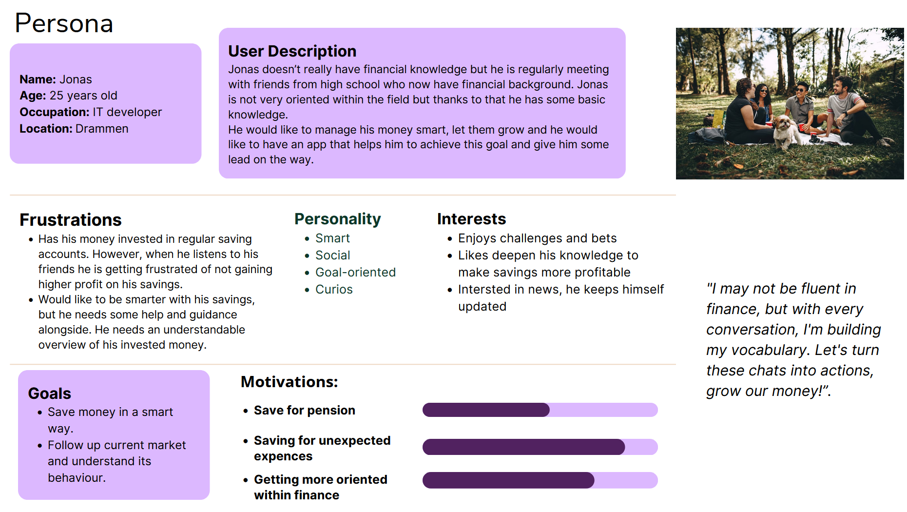
“I want an app that distributes useful knowledge that makes it easy to understand how funds and stocks work, and their purpose.”
Direct quote from interview participant

Key insights
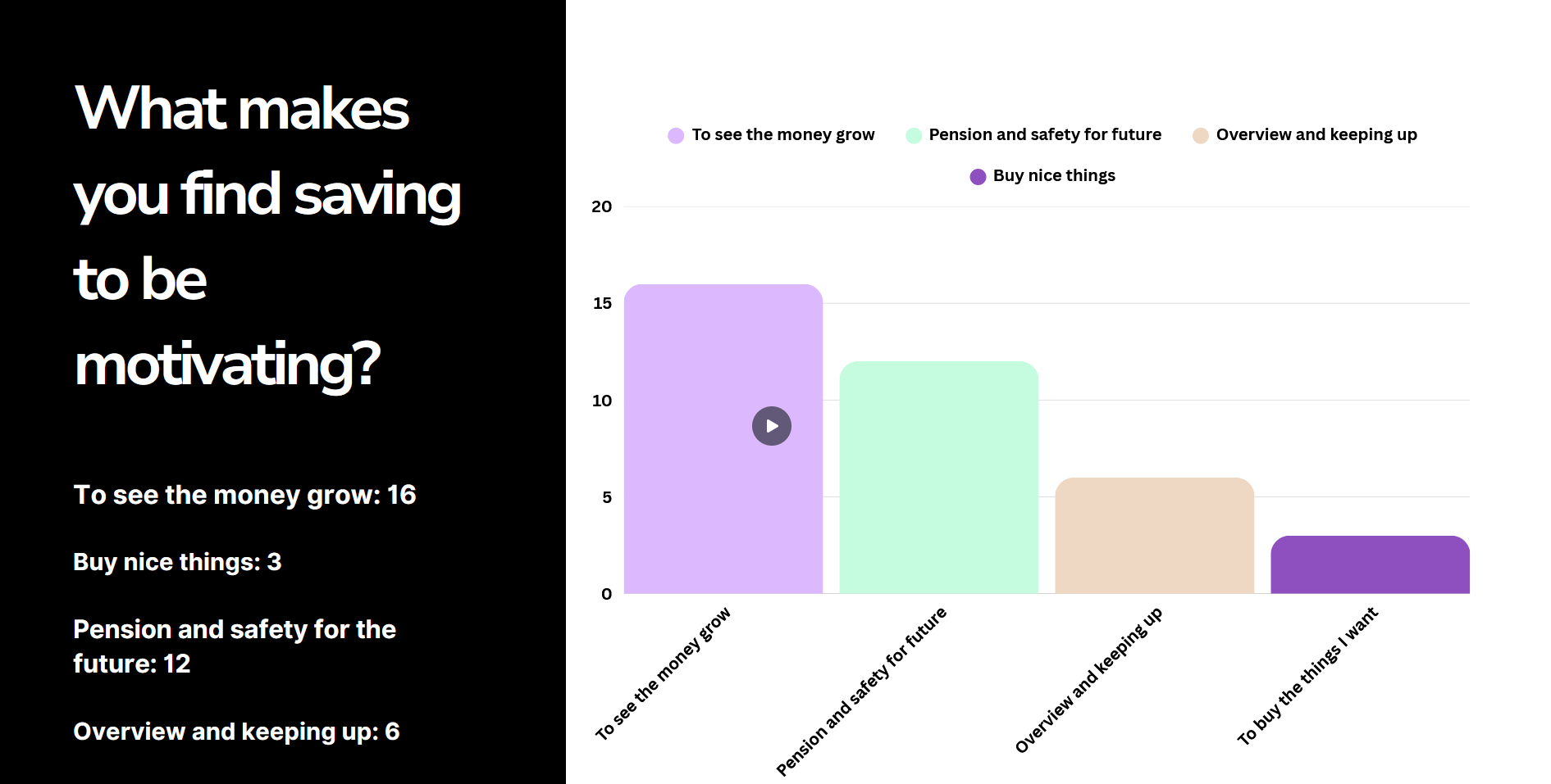
Investing feels less relevant in the present moment
Global events such as climate concerns and the pandemic have influenced how young users prioritize the present over long-term financial goals.
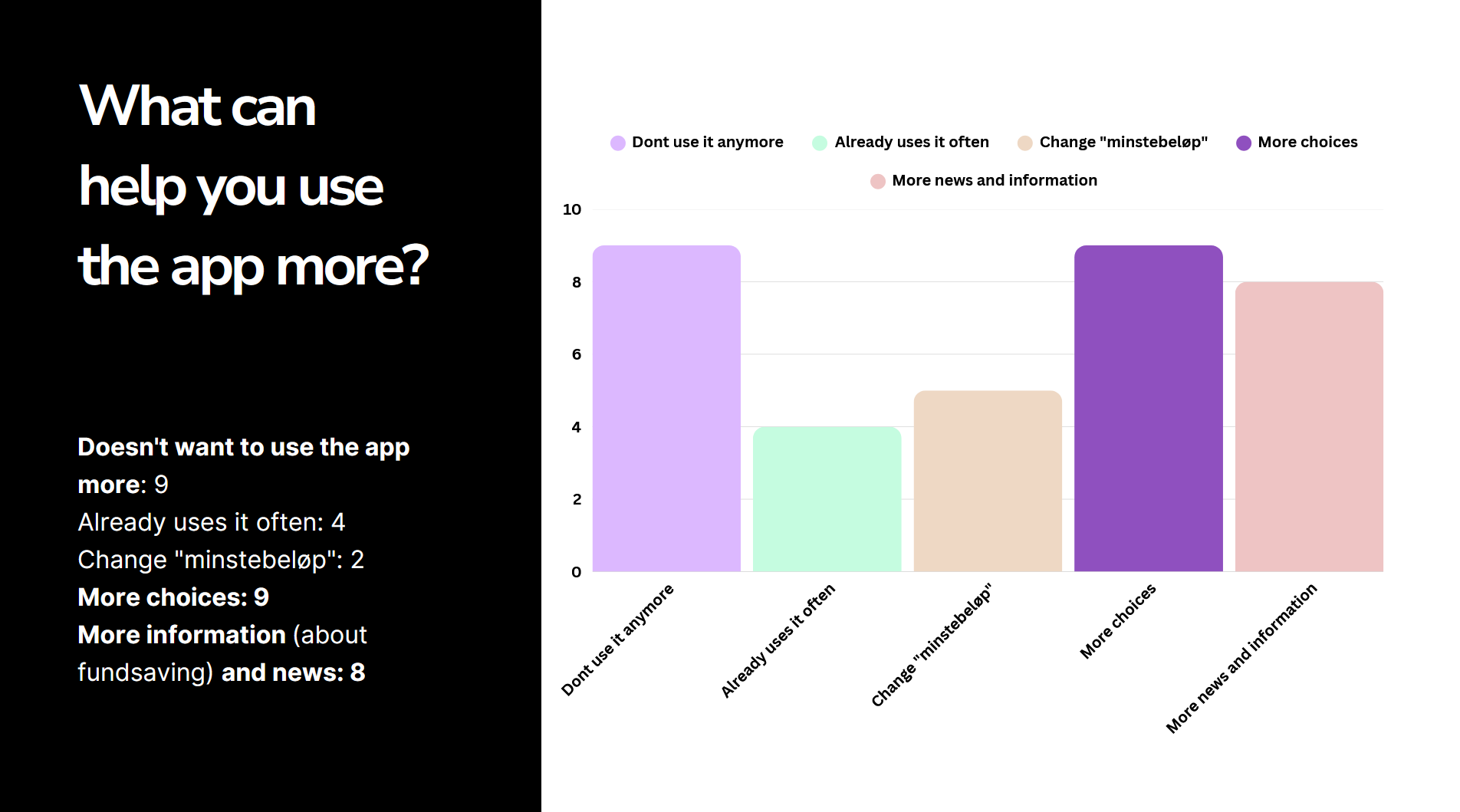
Lack of knowledge creates hesitation
Survey results showed that unclear terminology and limited guidance make it difficult for users to feel confident when choosing investment funds.
These insights informed the design decisions and highlighted the need for clarity, guidance and value in short interactions.
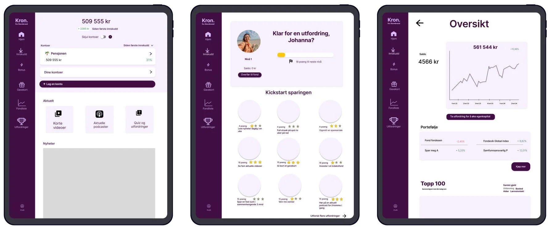
Design solution
The design solution focused on making fund investing feel understandable, relevant and manageable for younger users, while supporting short but meaningful interactions in the app.
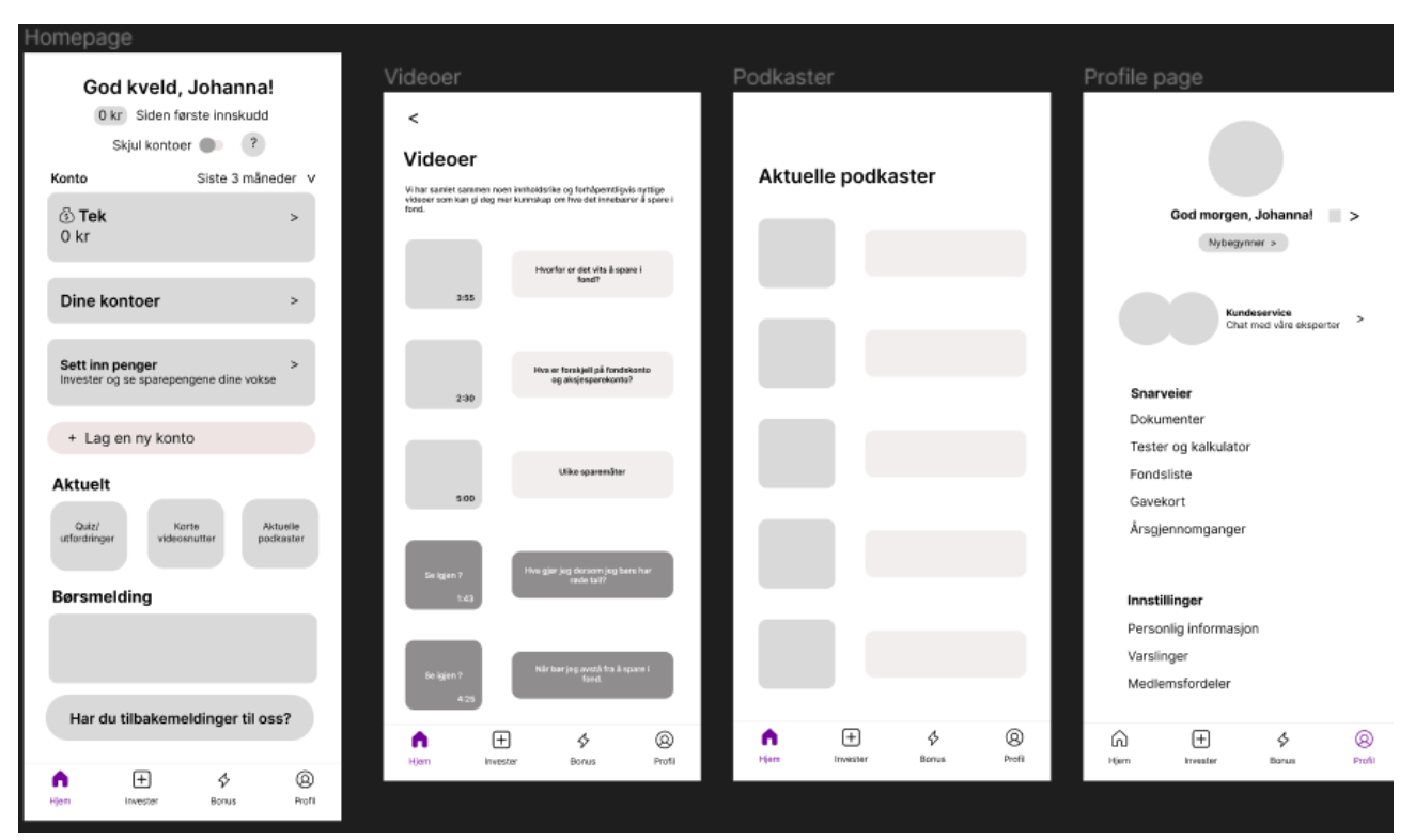
Here are a few sketches of our top solution:
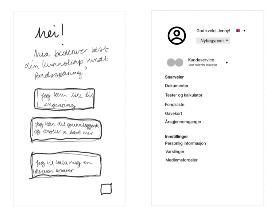
Based on the research insights, the solution prioritized clarity, guidance and trust over advanced features.
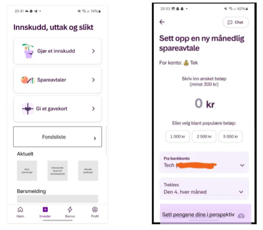
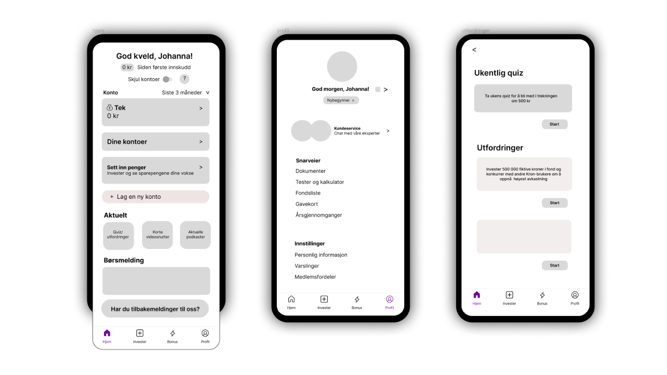
Clear structure and information hierarchy
Clear categorization of funds
Simple explanations of key concepts
Visual hierarchy that highlights what matters most
To address the lack of knowledge around fund investing, the app was structured to gradually introduce information rather than presenting everything at once.
This helped reduce cognitive load and made it easier for users to explore investment options with confidence
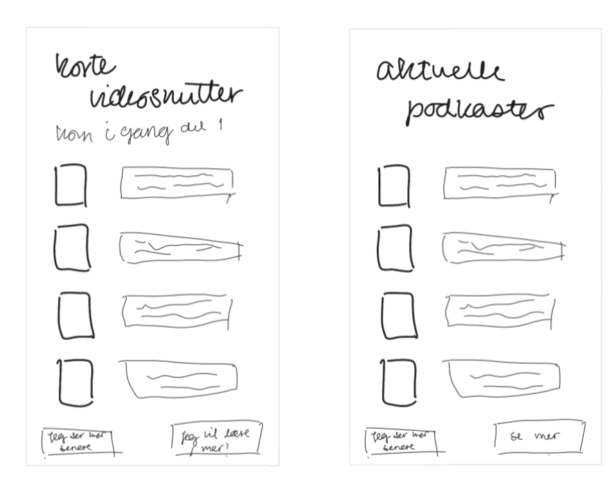
Supporting short, valuable sessions
With the goal of encouraging approximately 10 minutes of weekly engagement, the app was designed around focused interactions rather than long sessions.
Key information is accessible within a few taps
Content is broken into small, digestible sections
Progress and feedback encourage users to return without pressure
This approach supports regular use while respecting users’ limited attention and motivation.
The visual design aimed to create a calm and trustworthy experience, especially important for first-time investors.
Building trust through visual design
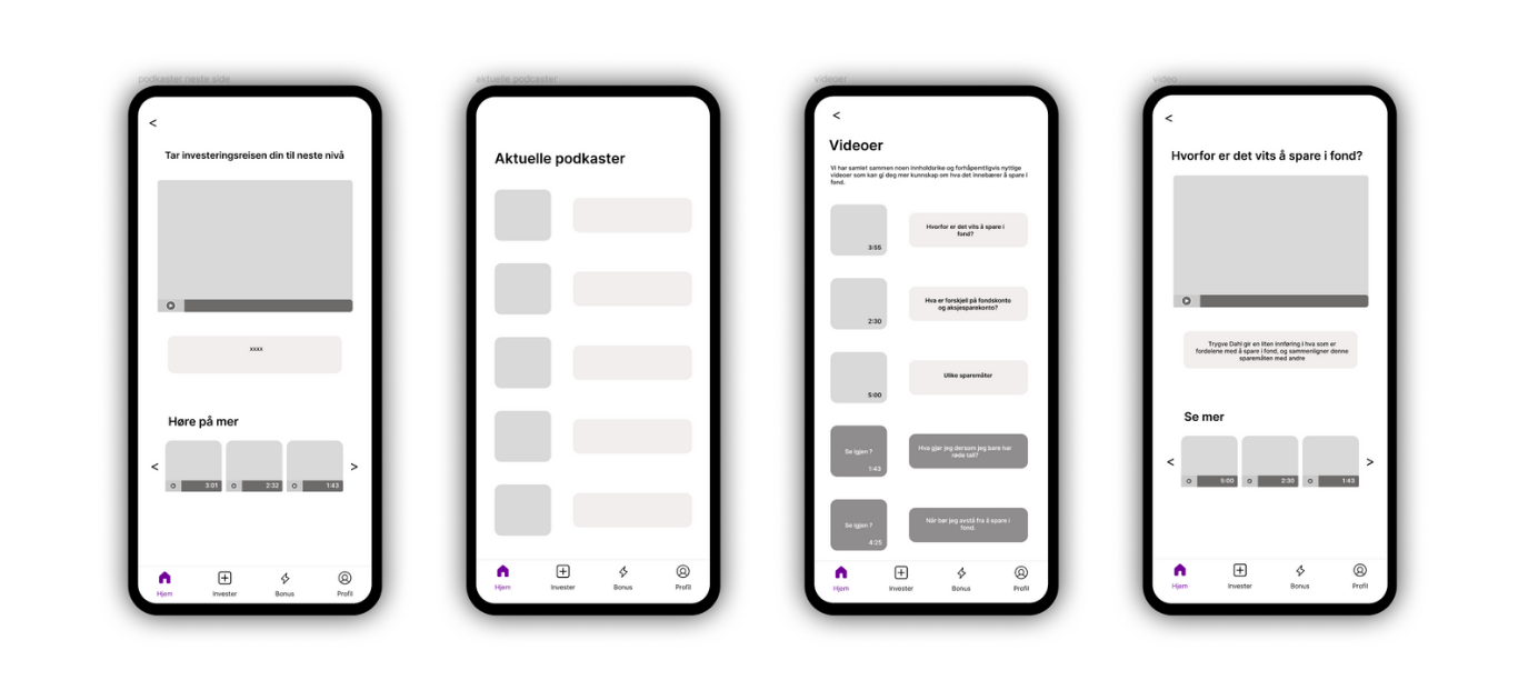
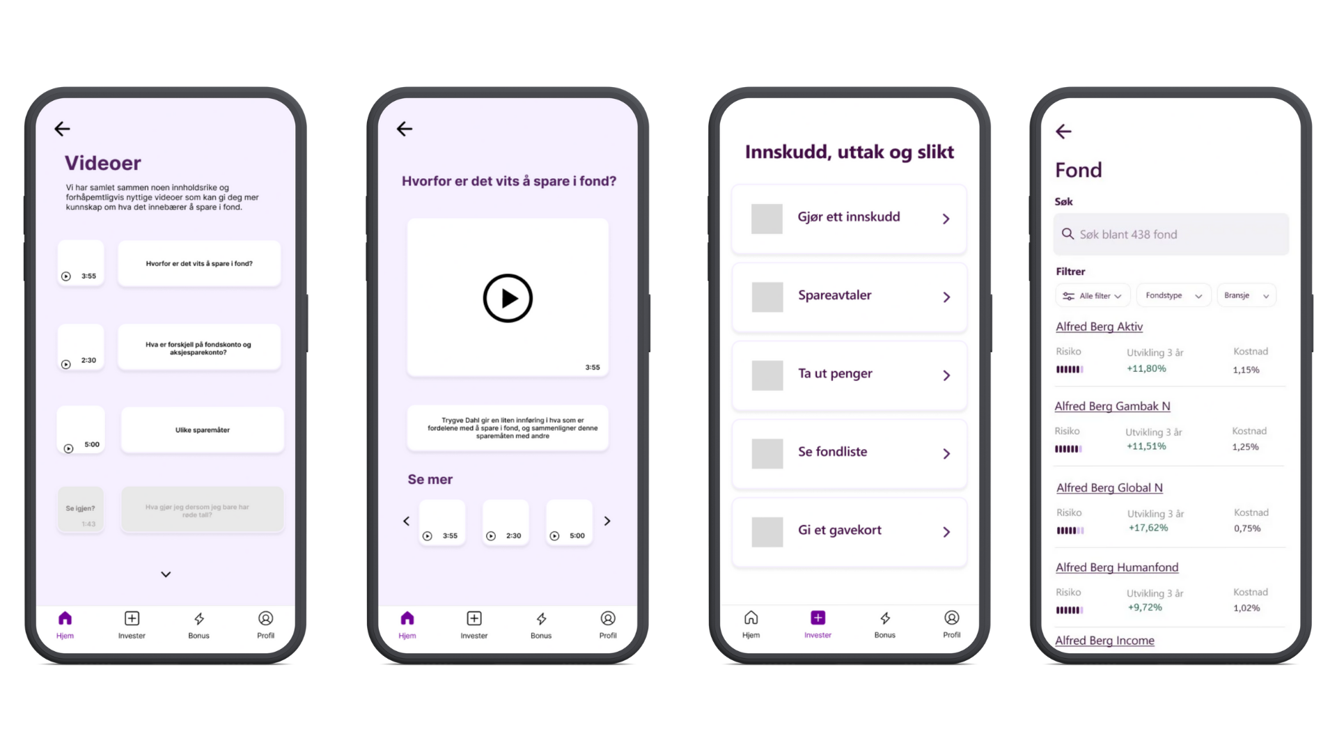
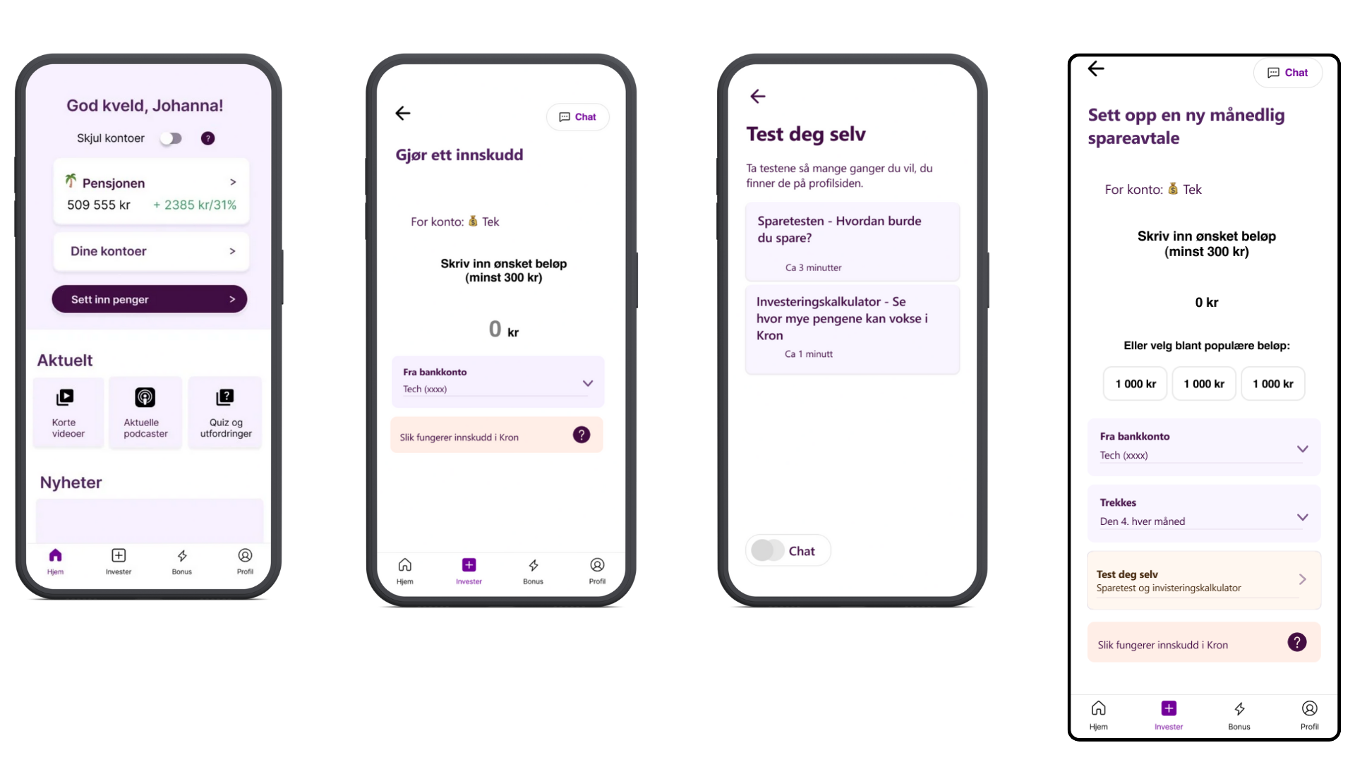
Clean UI with generous spacing
Consistent use of color and typography
Subtle visual cues to guide users through the interface
Together, these choices helped make the app feel reliable, approachable and easy to navigate.
Scalable design system
To ensure consistency across screens and platforms, a design system was developed to support both mobile and iPad layouts.
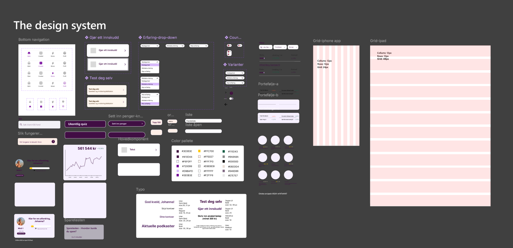
Reusable UI components
Consistent spacing and typography
Flexible layouts adapted for larger screens
This made the solution easier to scale and maintain across different devices.
The solution was iteratively refined through usability testing, ensuring that design decisions were continuously validated against user needs.
Usability testing & iteration
The goal was to validate key design decisions and identify areas where users felt uncertain or needed additional guidance.
Usability testing was conducted in two rounds to evaluate clarity, navigation and overall usability of the app, with a focus on first-time investors.
Testing round 1
The first round of usability testing focused on early prototypes to uncover usability issues related to structure and understanding.
The usability testing process helped ensure that the final design balanced user needs, product goals and clarity throughout the experience.
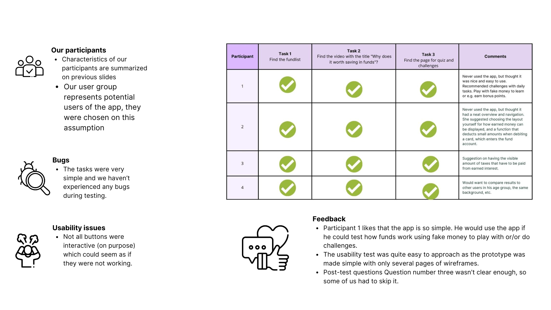
Key findings included:
Users needed clearer guidance when choosing funds
Some terminology caused confusion and hesitation
Navigation between key sections could be more intuitive
Based on these insights, the information hierarchy was refined and explanatory elements were simplified or restructured.
Iteration and refinement
Following the first testing round, adjustments were made to enhance clarity and minimize cognitive load.
Content was broken into smaller, more digestible sections
Navigation paths were simplified
Visual cues were adjusted to better guide user attention
These iterations aimed to make the experience feel more supportive and less overwhelming.
Testing round 2
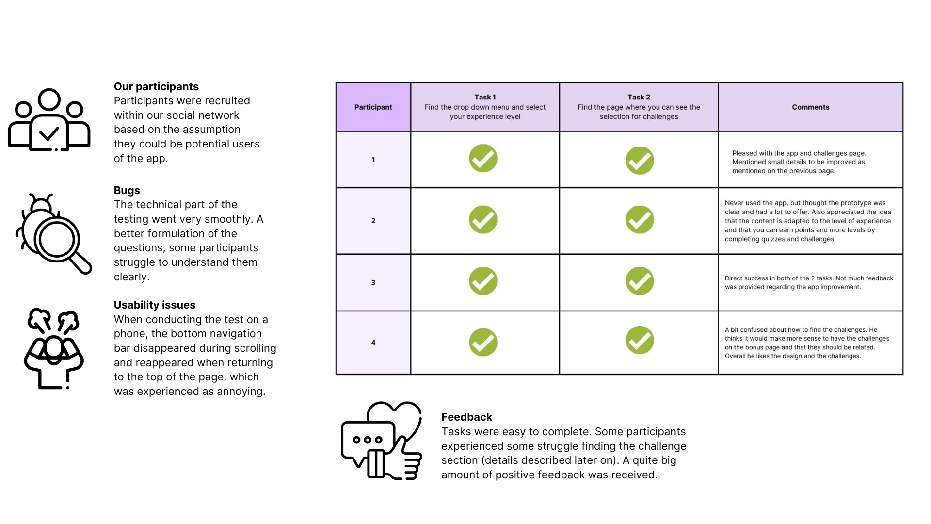
The second round of usability testing focused on validating the improvements and observing how users interacted with the refined design.
Results showed:
Improved understanding of fund options
Increased confidence when navigating the app
A smoother and more predictable user flow
The feedback confirmed that the design changes successfully addressed the main usability issues identified earlier in the process.
Outcome & learnings
The project resulted in a cohesive and user-centered investment fund app concept tailored to younger users, balancing clarity, guidance and trust.
Through research, design and testing, the solution addressed key barriers to investing by making information more accessible and interactions easier to understand.
Outcome
A structured and approachable mobile app concept for fund investing
Improved clarity around fund options and key financial concepts
A design that supports short, meaningful weekly interactions
A scalable design system adaptable for both mobile and iPad
The final solution aligned user needs with product goals, creating an experience that feels informative without being overwhelming.
Learnings
This project strengthened my understanding of designing for complex domains and users with limited experience.
Key learnings included:
The importance of introducing information gradually to reduce cognitive load
How usability testing can uncover hesitation and uncertainty early in the process
The value of balancing user needs with business and product constraints
The role of structure, hierarchy and consistency in building trust through design
Reflection
This project reinforced the importance of empathy, iteration and clear communication when designing financial products for younger audiences.
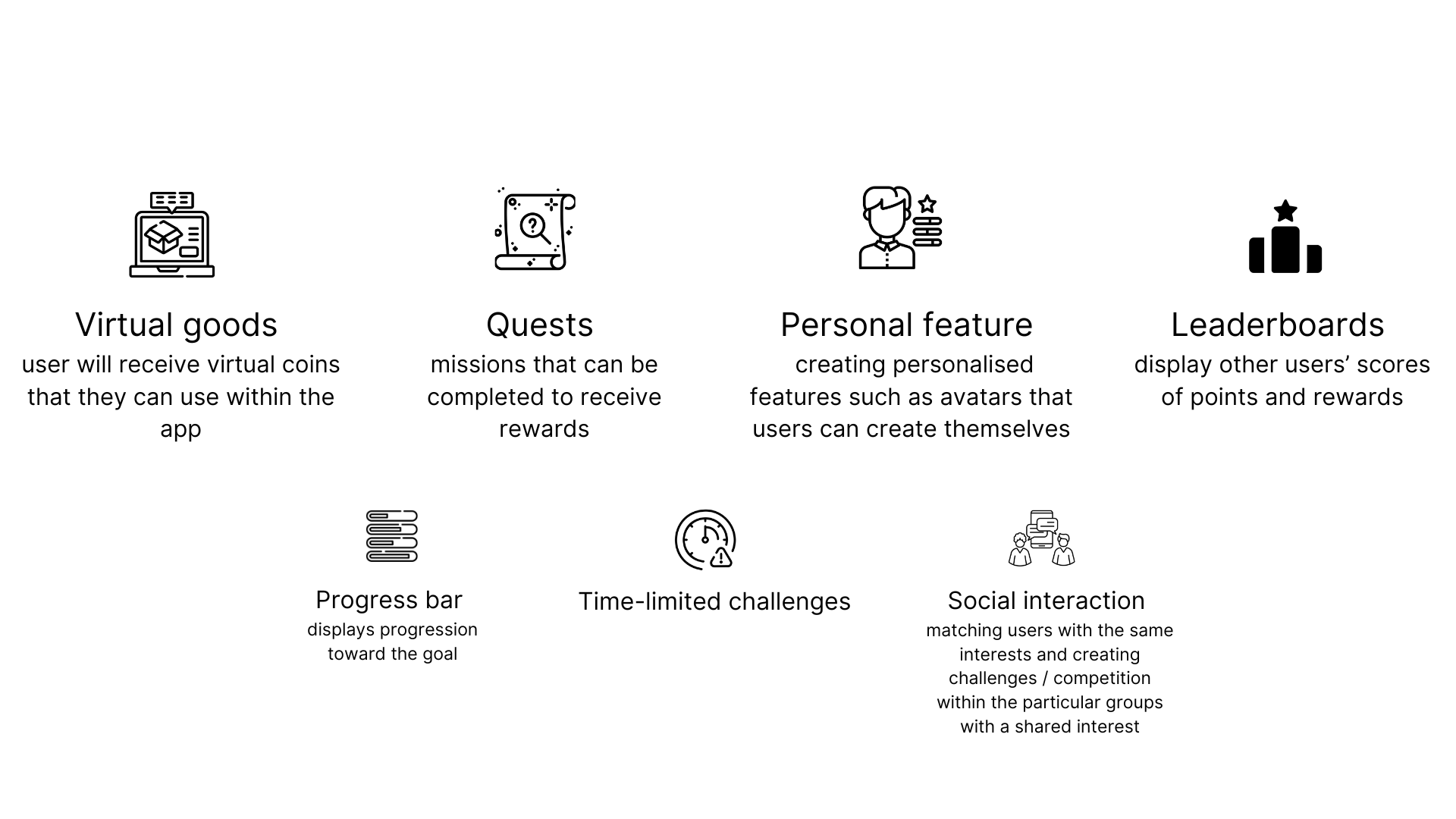
If I were to continue developing the solution, I would further explore personalization and educational features that adapt to different levels of investment knowledge.